HOW I MAKE A COMIC BOOK PAGE, PART 3!
Comic Book Practice, Part One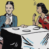
No Regrets
Comic Book Practice, Part Two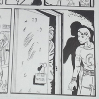
Becoming
Comic Book Practice, Part Three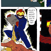
The Flames
Comic Book Practice, Part Four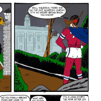
Arising
Comic Book Practice, Part Five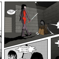
Absorbing
Comic Book Practice, Part Six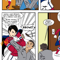
Inspiring
Sam Battin here. I'm trying to learn more about comics by copying pages I think are good. This is the third time I've tried this.
Step One: Getting Started
For the third attempt, I wanted to learn more than I had, and also I wanted to increase my output. Rather than doing one page, I wanted to see if I could get two pages done in a week. My thinking was that that'd be 100 pages a year, which is almost bimonthly. As we'll see, it's not super-easy but I'm starting to think it's possible.
Step Two: Doing the Pencils
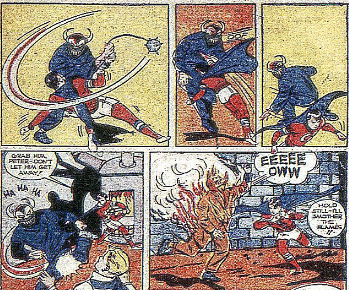
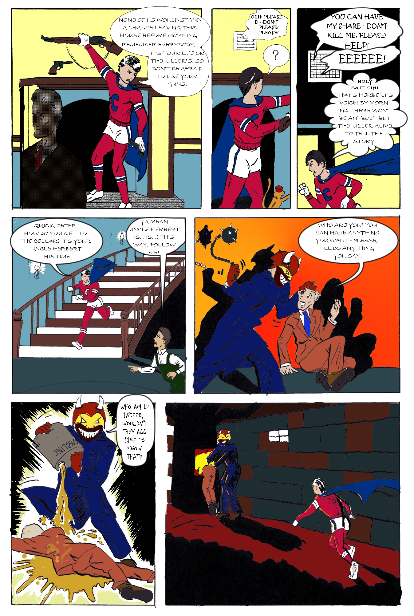
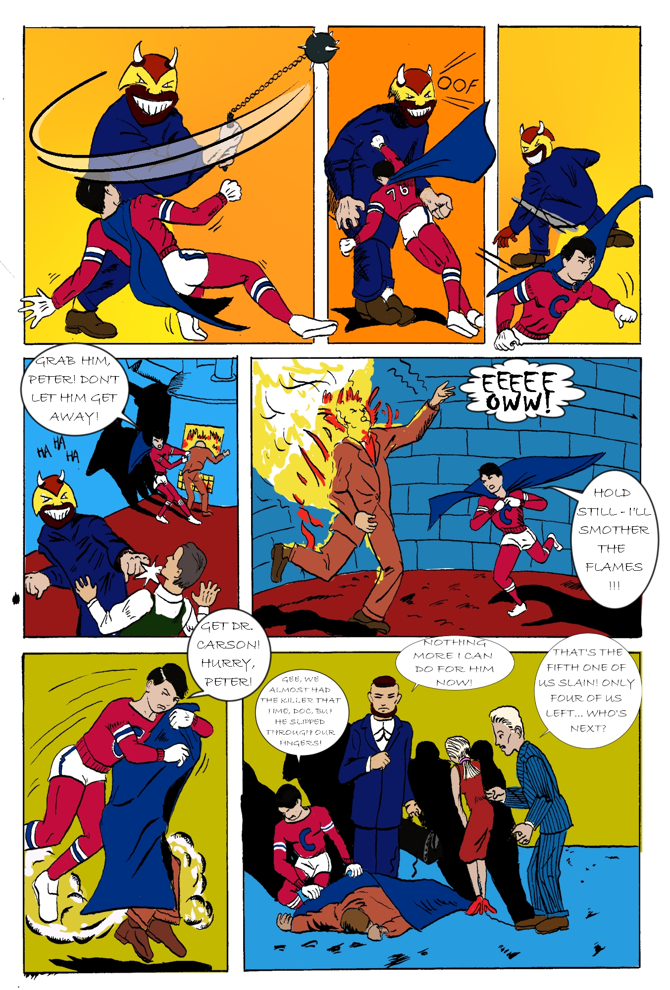
This week I was working with Boy Comics #7, pages 10 and 11, published in 1946, written by Chuck Biro. I think Mr. Biro also drew this one. There's a big difference in the art between this and the last, and I'm starting to figure out what I like vs. what works.
I chose these pages because I wanted to do an action scene. This was interesting because the guy was pretty heavily influenced by action movies of the time, as well as stuff (I thought) from the Fleischer brothers cartoons like Superman. However, the difference here was that the backgrounds didn't draw the reader inside the page. Like, my feeling is that with the Norman Maurer stuff, there were a bunch of diagonal lines all pointing inside the page. On this page, a lot of the background lines were parallel to the panel borders, which makes the work seem flat in comparison.
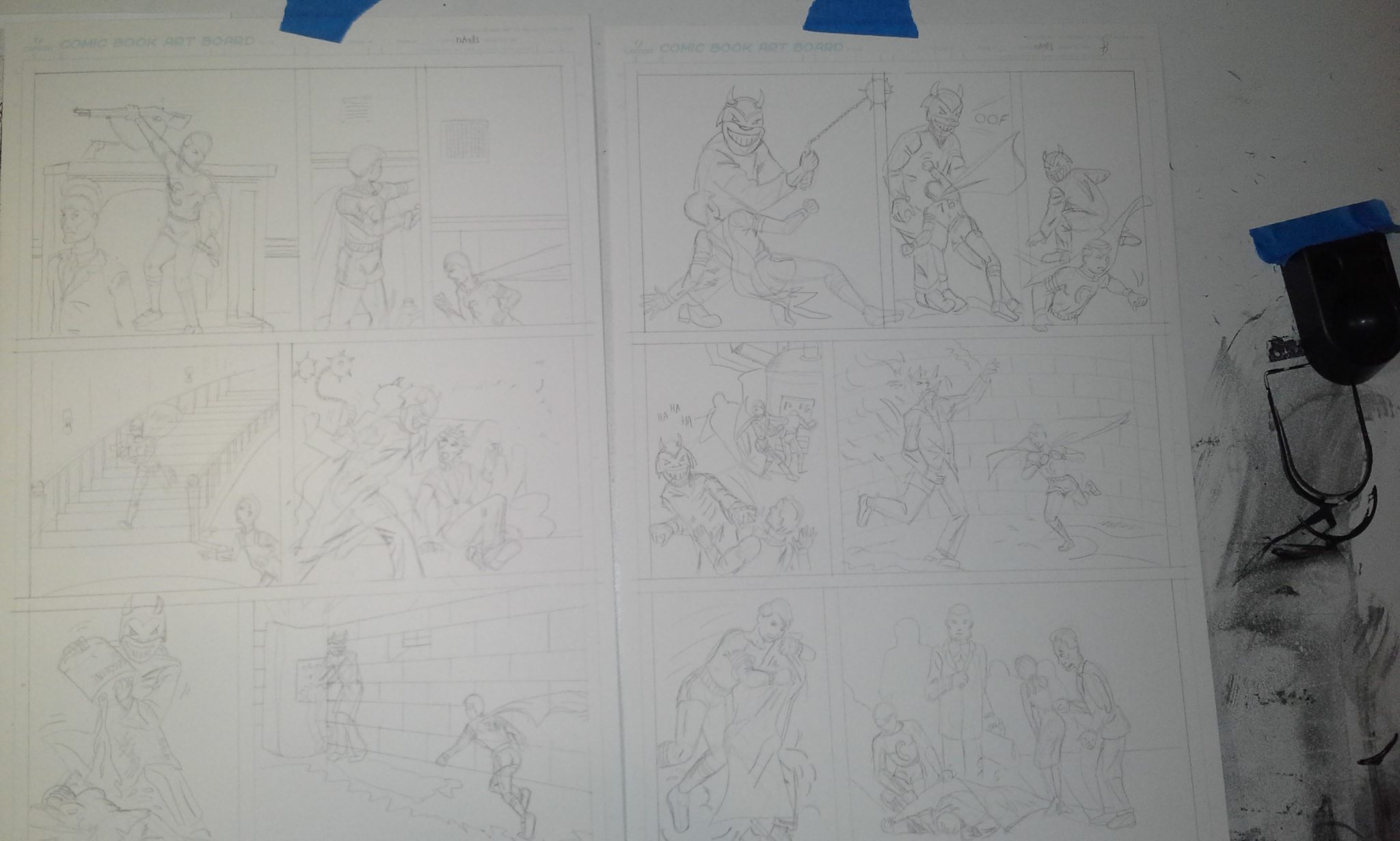
At any rate it only took me two days to finish both pages of pencils:
|
Step Three: Doing the Inks
The inking was easy too; I managed to get both pages inked in two days. So at this point I'm four days in and I've got two pages pencilled and inked. I didn't take a photo of it, but here's a photo of a bunch of those little circle things you find below the caps on soda bottles:
|
Step Four: Post-Production
I was working from a super-shitty scan this time, too. Like whoever was working the scanner didn't feel it was worth their time to maybe focus the fucking scanner or check and see how shitty their output was.
Lookit this crap! Not only was the colorist in 1947 on his lunch break and trying to get these done before deadline, but the scanner was terrible, as well. This is the work of "everything4less". Not all of their scans were this bad, but some were worse and some were better. I'm not complaining too much, cuz this was only ten bucks but take a little pride in your work, will you?
|
Luckily for me, I did find a much higher quality scan at the Digital Comic Museum. These people care about quality. Naturally I found this after I'd started on the coloring, but it was good to find this resource. In case you want to see the original, you'll need to log in and I can't show you the direct link. Just look for Lev Gleason Publications, Boy Comics #7 and don't get distracted by all the other stuff that's in there.
At any rate, I used Photoshop to color it again and it took a long time, really. Not to mention there was Christmas and New Years and plenty of drinking in between but I think it took ... I finished the pencils on Christmas and I'm writing this on January 5, so yeah, about two weeks.
I used the same method to color as last time, e.g. copied the black inks and set that as a separate layer, and then made individual layers for each color. It works, but it was really time-consuming. There needs to be a faster way to do this. Now, I could use the 1946 method of coloring, e.g. don't give a shit because comics are stupid and do a shitty job, but I like to think my readers deserve more.
I used Manga Studio 5 to do the dialog balloons again. It worked, but I think the DPI resolution was different on the two pages; one was 400 DPI and the other was 300 DPI. This meant I had to use a different font size on the second one, so I ended up having to rasterize the balloons so I could re-size them.
I also used the Manga Studio 5 effects ruler. I thought the swinging of the flail on the top left was a neat effect. Mr. Biro might have used an ellipse ruler to get this done, but I couldn't figure out how do to it with a pen and not fuck everything up. With a pen, you get one chance. With a computer you get a bunch of chances, unless your computer crashes.
Here's take one of the swinging effect. THis didn't work. I used the bezier tool ruler and painted over that. I didn't like the line thicknesses, and it didn't point at all toward the business end of the flail:
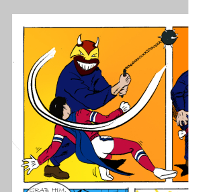
|
Here are the full-size versions:
- http://www.comics-for-grownups.com/img/crimebuster-3a-final.jpg
- http://www.comics-for-grownups.com/img/crimebuster-3b-final.jpg
Step Five: Recriminations
I am a little bummed out that it took so long to get these done. On the other hand, it took so long because I need to learn how to do colors faster, and I didn't know that. This gives me a reason to experiment.
Also I need to work better on backgrounds. I did not give a shit about drawing the walls correctly in the basement. Sheesh. So I just drew a bunch of lines and called it a day. I think norman Maurer's method is better; always use diagonal lines in the backgrounds.
Finally, if the work goes on past a certain timespan, I feel upset and rushed. Next time I'll try doing two pages again but I'll experiment with doing colors faster.
NEXT: Read Comic Book practice Part 4 or go back and read Comic Book practice Part 2