HOW I MAKE A COMIC BOOK PAGE, PART 4!
Comic Book Practice, Part One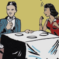
No Regrets
Comic Book Practice, Part Two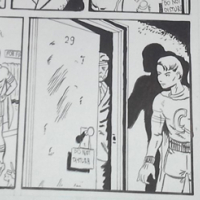
Becoming
Comic Book Practice, Part Three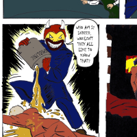
The Flames
Comic Book Practice, Part Four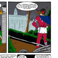
Arising
Comic Book Practice, Part Five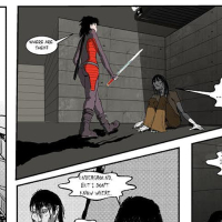
Absorbing
Comic Book Practice, Part Six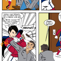
Inspiring
Sam Battin here. I'm trying to learn more about comics by copying pages I think are good. This is the fourth time I've tried this.
Step One: Getting Started
This is number four in a series and I gotta say, life gets in the way sometimes. I finished the 3rd installment at the beginning of January 2014, and here it is more than halfway through February before I put up the fourth installment. It's two pages! What took so long?
Couple things. #1, laziness. #2, getting a new computer. My old one was starting to totter, and the effort of getting a new one, and figuring how to import all of my files without losing anything important, took up a ton of time.
#3 was unavoidable, but it was a good lesson. I took two weeks to compose a single page of comics based on Ron Marz's call for entries. That particular journey is detailed here in part five.
At any rate, I learned a couple of good things this time around. I fell well short of my goal of two pages drawn, inked, and colored a week but it's about the effort.
Step Two: Doing the Pencils
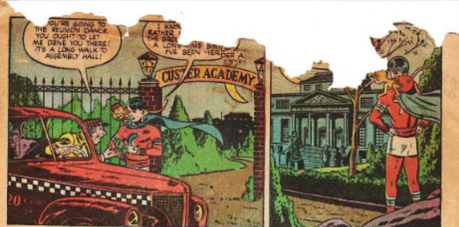
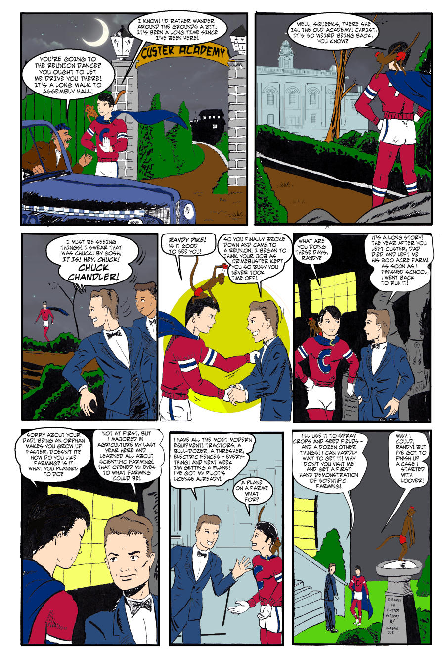
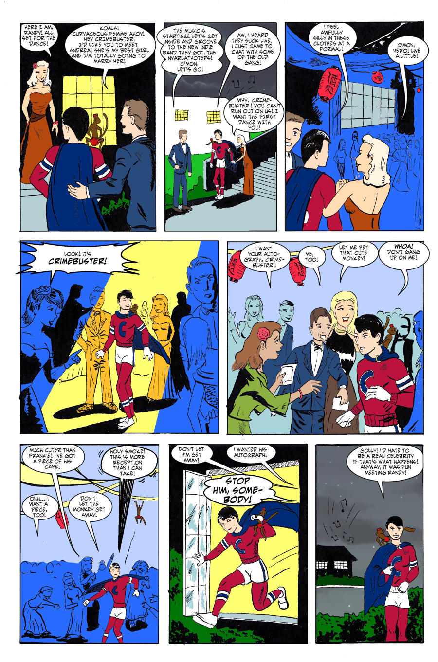
This week I was working with Boy Comics #33, pages 2 and 3, published in 1947, written by Chuck Biro. Drawn by Norman Maurer. This one had girls in it, finally.
I liked these pages because it showed the fun side of Crimebuster, and also because I liked it that Crimebuster went to school at Custer Academy. Knowing the history of what happened with General Custer it's pure awesome that there's a whole school running under the name of a man who said "I would be willing, yes glad, to see a battle every day during my life."
At any rate it only took me two days to finish both pages of pencils:
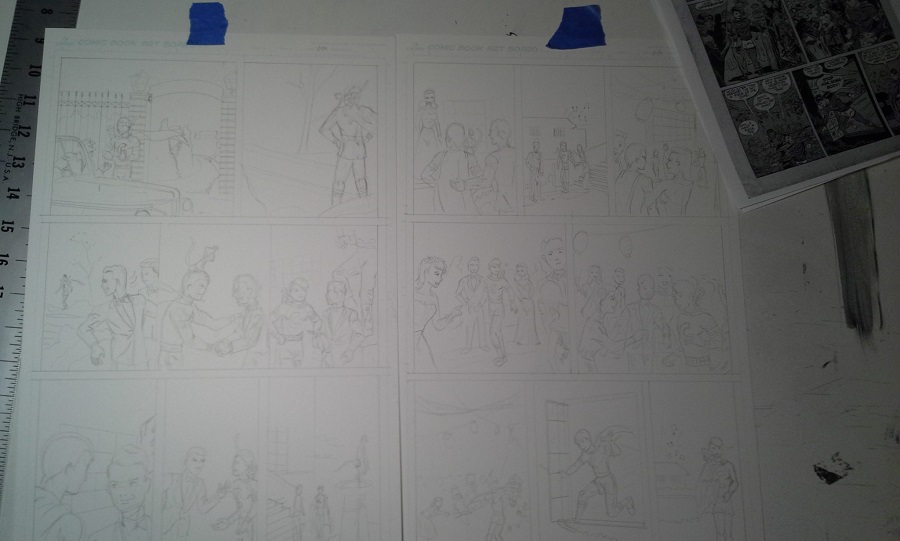
|
Also I experimented with different ways of doing some expressions. Here, I like the expression of Crimebuster better than the inked version. Never be afraid to draw construction lines.
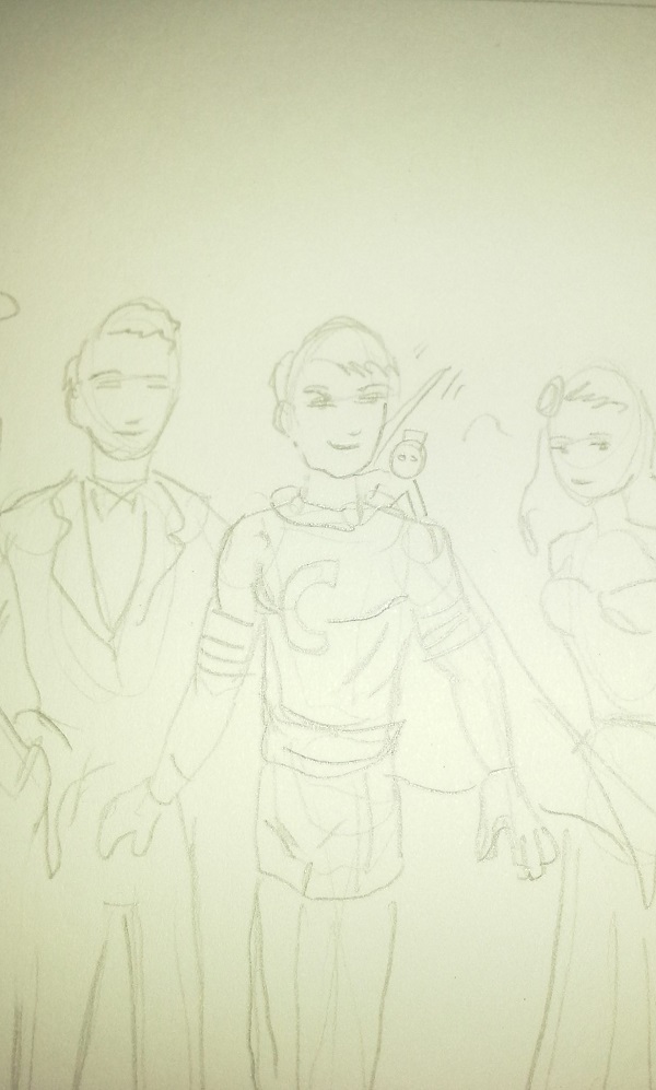
|
Step Three: Doing the Inks
Inking is difficult. I've been doing some stuff on the computer and for the moment, I do feel like I can do a better job with a nib pen on bristol board than I can with a stylus and a computer tablet. However, using speedball pens bites balls. I try to keep those suckers as clean as an M16A1 in Viet Nam, but like that fabled gun, the speedball pens always let you down.
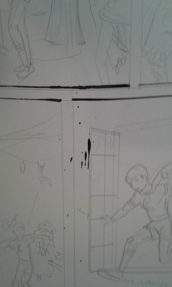
|
So this time, I just drew in a temporary panel border as a single line without a ruler. The rest of the page I drew with a nib except for the big black areas where I used a brush.
|
Step Four: Post-Production
The more I use a computer, the more I like it. Being able to undo mistakes is awesome. On the other hand, coloring stuff takes a long time. On this one, I feel like I'm getting a better sense of what works and what doesn't with color.
I'm also using the computer to do word balloons. Oh man that is so easy, doing word balloons with a computer. There's even a tool that lets you set up a word balloon tail, and you can set this to be straight or curvy! Wow!
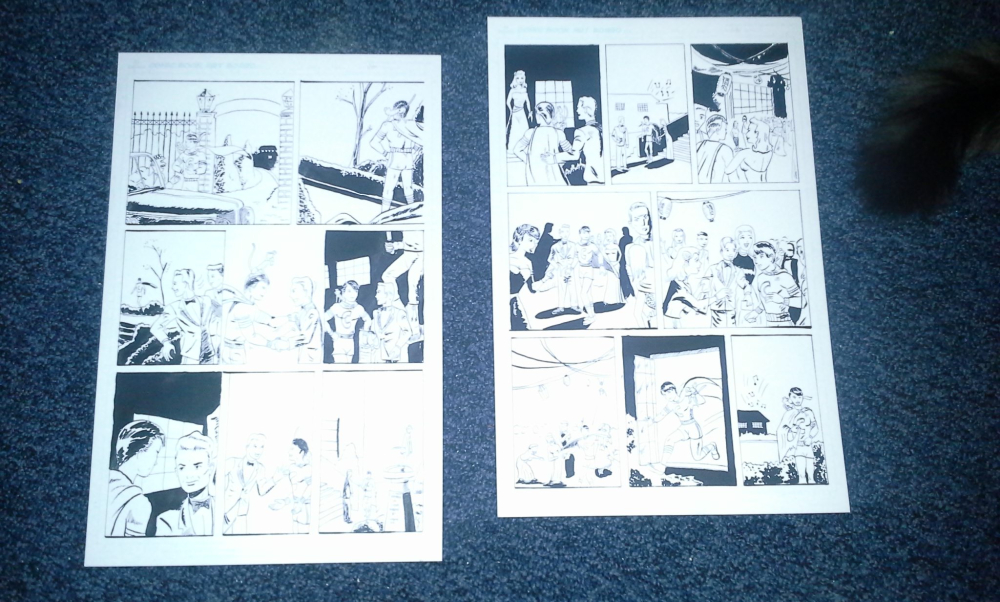
I got to mess around with the dialog a little bit because the copy I was working from was damaged. It may be that Crimebuster's thoughts on seeing his alma mater are lost to history, but if you can let me know what he said, please drop me a line. Make sure to check out the original story at the Digital Comic Museum.
|
Here are the full-size versions:
- http://www.comics-for-grownups.com/img/33-02-L.jpg
- http://www.comics-for-grownups.com/img/33-03-L.jpg
Step Five: Recriminations
An important thing, I found, is avoiding the use of purple and pink colors. They look like crap. It's like Lisa Frank My Little Pony stuff. I liked what Norman Maurer was able to do with colors, especially with the spotlight effect. Also in the crowd scenes it would drive a colorist nuts to have to color each person's clothes differently, so I used different shades of blue to indicate midground and background levels rather than purple as in the original.
Manga studio has some cool tools to help you trace buildings from pictures. I feel okay about what i was able to do for the school.
The first page's dialog ballons were a little messed up; it was by the second page I was able to figure out how to set the balloons so they could line up with the panel borders without looking lumpy. I still need a solution for Crimebuster's hair, though. In the original they used blue, but here I'm using midnight black because I thought blue was a desperation option. Maybe I'll have to think about it some more.
Thanks for reading! See you next time!
NEXT: Read Comic Book practice Part 5 or go back and read Comic Book practice Part 3